
Sally Beauty & Loxa Beauty E-Commerce (2014-15)

Background
In the Fall of 2014, before I graduate from my Master program, I had opportunity to join the Loxa Beauty (Sally Beauty Holdings, BSG) as a UX/Web Designer. I was the only one in the company that focused on user experience, and was responsible for almost everything that’s design-related. Also in charge for designing the mobile experience.
About
Loxa Beauty is a new e-commerce site offering the ultimate beauty shopping experience for consumers. It was determined to bridge an important gap between consumers, beauty professionals and major manufacturers. In 2012 Loxa Beauty was acquired by BSG - Sally Beauty Holdings, Inc. and launched a new website platform in 2013.
Overview
For Loxa Beauty e-commerce projects, I planned and conducted user research, synthesized findings and made product decisions, collaborating with the Director of Technology and Marketing. I created prototypes, which could be sketch mockups or fully functional web applications. I made detailed design specs for development team.
Design
First, I redesigned the homepage of Loxa Beauty. The homepage of e-commerce site is often the highest traffic page. It has a number of tasks to perform that should providing an easy way for consumers to find what they came to the site for. This single page is responsible for building trust, driving sales, and creating lifelong consumers. So from the beginning of this redesign work, I defined problems, which included unused links, having to jump backwards and forwards between sub sites, and redundant information. I redesigned homepage that make use of quality photography for homepage banner, removed top slider that keep it simple moved Quick Links to fooder, used a banner to instead of the circle badge that provides stylist login.
Homepage before and after


Then, I created new user flow for registration and login process. The high-level challenge that Loxa Beauty provides both consumers and stylist service. Kicking off with a research about the scenario that needed to be designed, I split two kind of users had to pursue two different purposes. One focused on online shopping . The other worked as beauty professionals and major manufacturers that need manage their business, customer and commission. Based on the testing of previous version, I found out that stylist couldn’t login from homepage, also consumers always accidentally click the stylist login. It’s very important to clearly differentiate the registration and login, and to minimize the chance of users accidentally attempting to log in via the registration form.
Login and Register Wireframes (Consumers and Stylist)


Login and Register Final Design A (Version of Oct 2014)
Login and Register Final Design B (Version of Oct 2014)


Consumers Register Page Final Design (Version of Oct 2014)
Stylist Register Page Final Design (Version of Oct 2014)


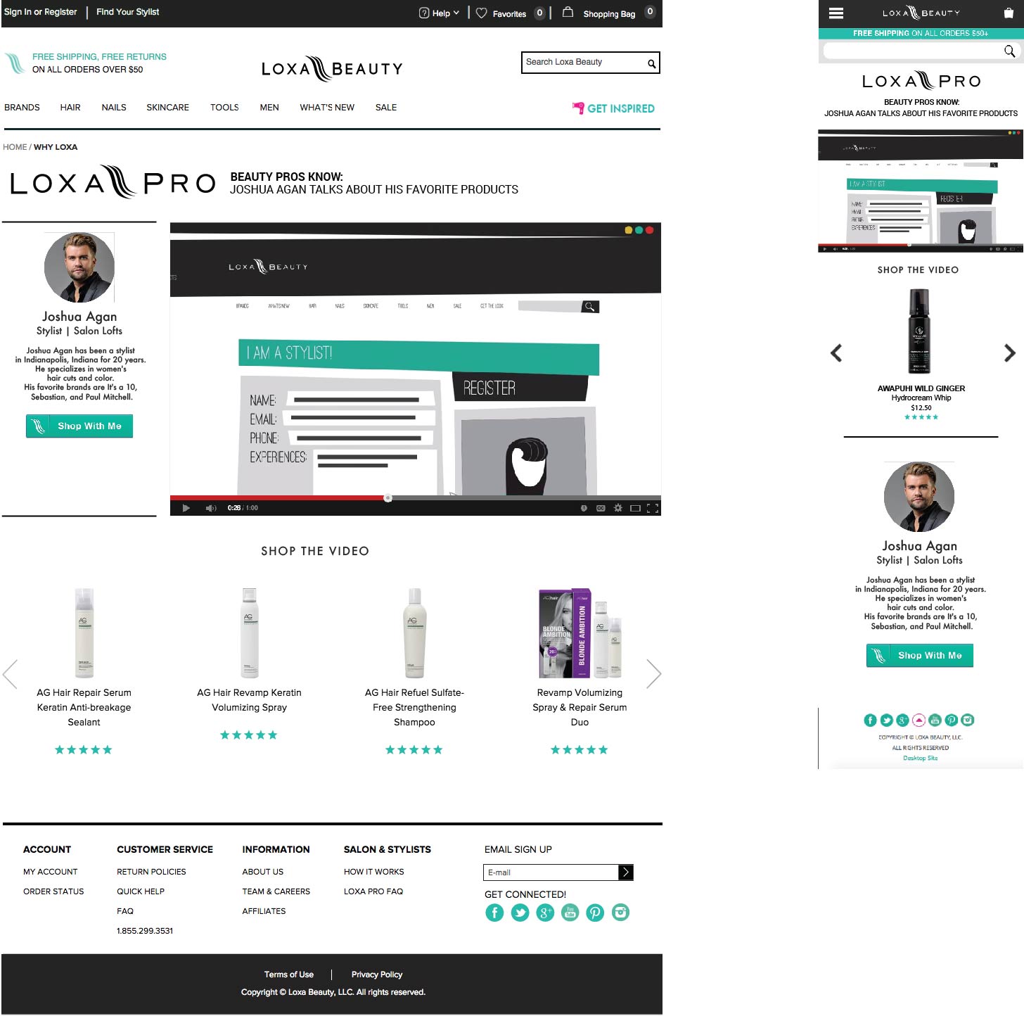
Stylist Video Landing Page
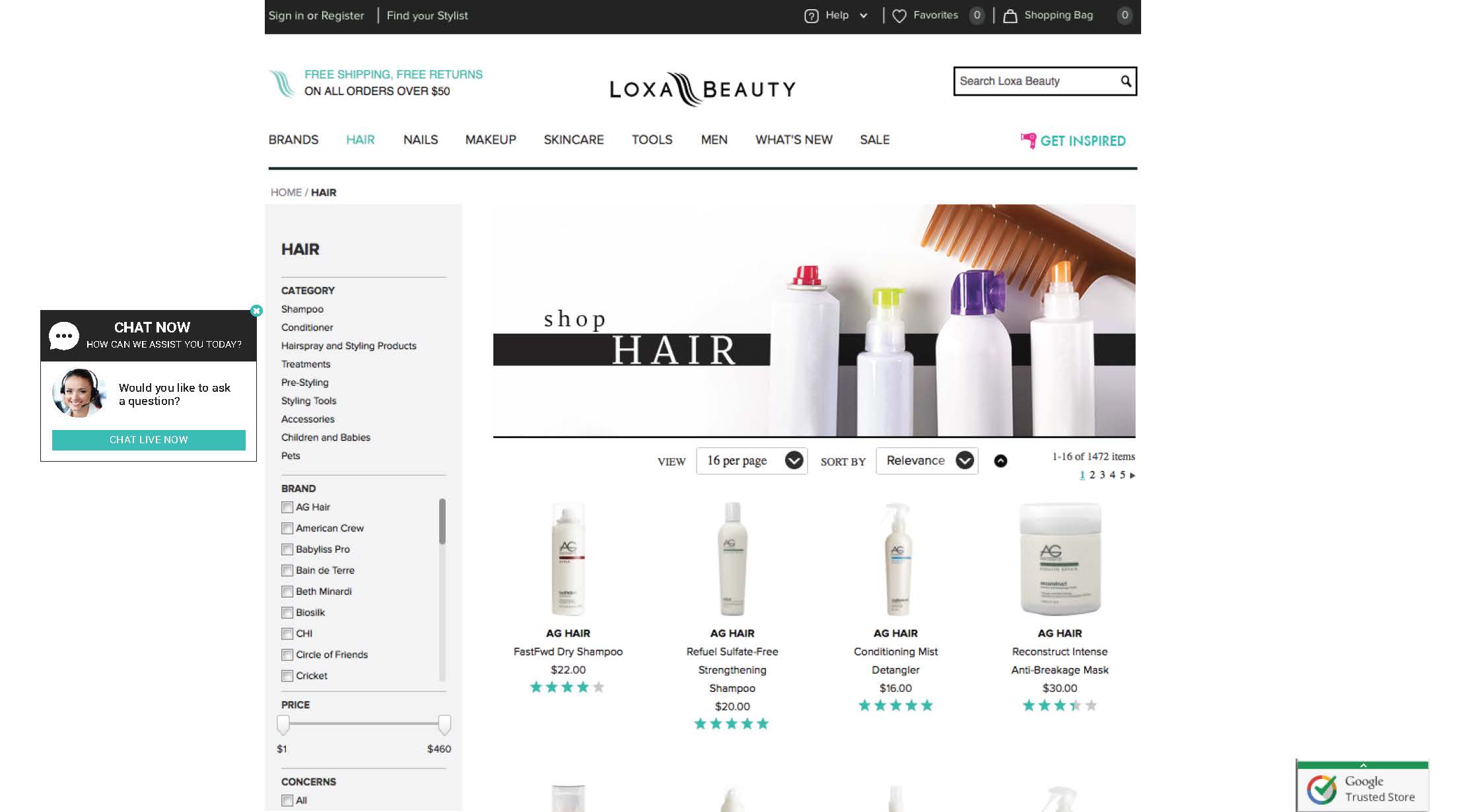
Hot Tools Page 1
Hot Tools Page 2


Brand Landing Pages (Version of May 2015)


How to layout all elements in the product detail page, that needs to be dealt with as a whole was a big challenge for redesign. A good Product Page should let user get key information fast. So I placed product name and information, price, size selection and high quality images on the top of the page. Keep the “Add to Bag” button color clear and stand out. Also provided “Use With” section based on particular sales requirement.
“You May Also Like” is a way to recommend e-commerce product to customer. It’s increase customer engagement in e-commerce by providing personalized product recommendations. In our case, customer chose their product based on personal preferences and hair characteristics. So I didn’t select “Customers Also Bought” recommendation type.
Customer Reviews are important for Product Page. Customers more likely to purchase after reading a review. In our case, business has required Expert Review VS Customer Review because lot of professional hair & beauty products need instructions. Highlight expert reviews and default review sorting by high to low was the solution for this case.


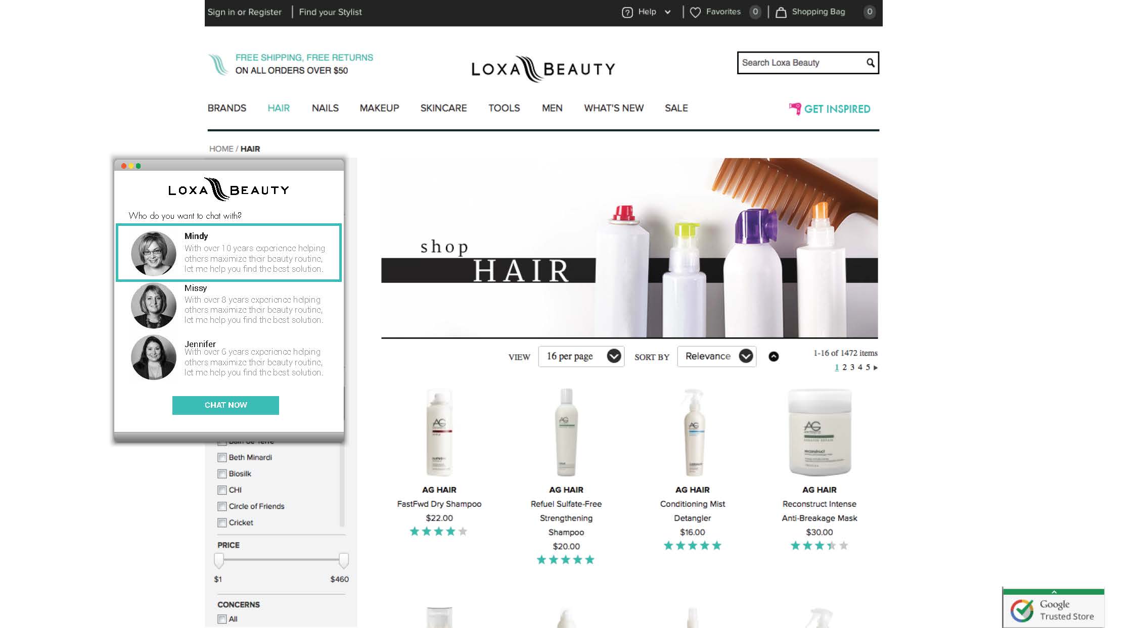
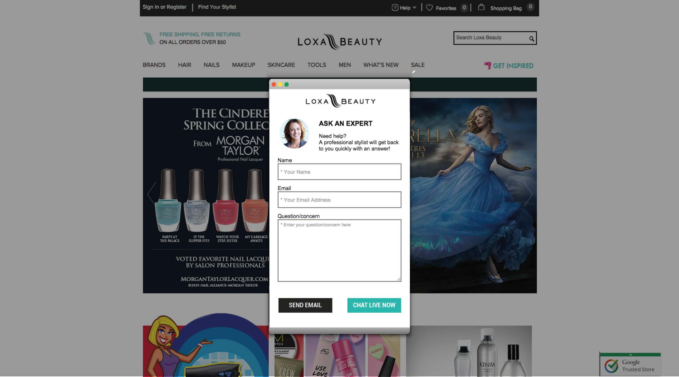
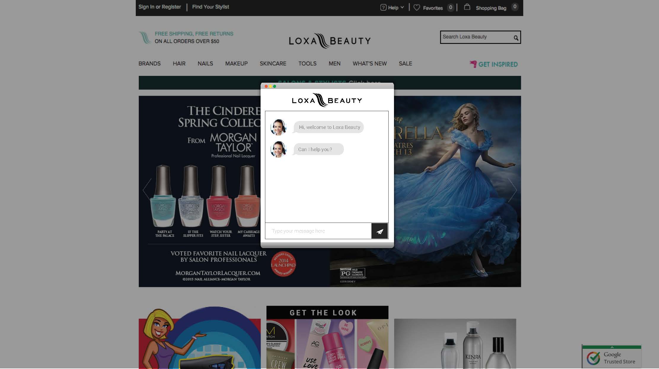
After I made the product page as user-friendly as possible, I started thinking about offering advice over chat that make customer to make a purchase easier. Live chat is a simple ways to improve a e-commerce site’s conversion rate, because it provides a platform to solve customer’s problems or concern. In our case, we not only provide "Ask An Expert" focus on hair & beauty product info, but also provide "Customer Service" focus on whole shopping service issue.

Live Chat (Ask for Expert & Customer Service)


Any small increase in checkout page usually has a direct impact on how much more money site makes. So, the challenge is how can my design get more people to go through checkout flow and complete purchases. When customer add product to the shopping bag, a small quick view drop down window showing with a sand out "Checkout" button. For displaying Shopping Bag well, I kept shopping bag contents clarity and control. It was easy and obvious to understand what’s in the cart and what’s the final cost including shipping and taxes. Also easy to make changes, such as remove products and update quantity.
My Shopping Bag and Check Out Workflow

My Shopping Bag & Checkout Pages (Vision of March 2015)


